Flame Kabob is a family-owned Middle Eastern restaurant in Las Vegas and Henderson. Renowned for its authentic dishes made from scratch using top-quality, Halal meats, the restaurant has garnered a loyal customer base over its 30 years of operation.
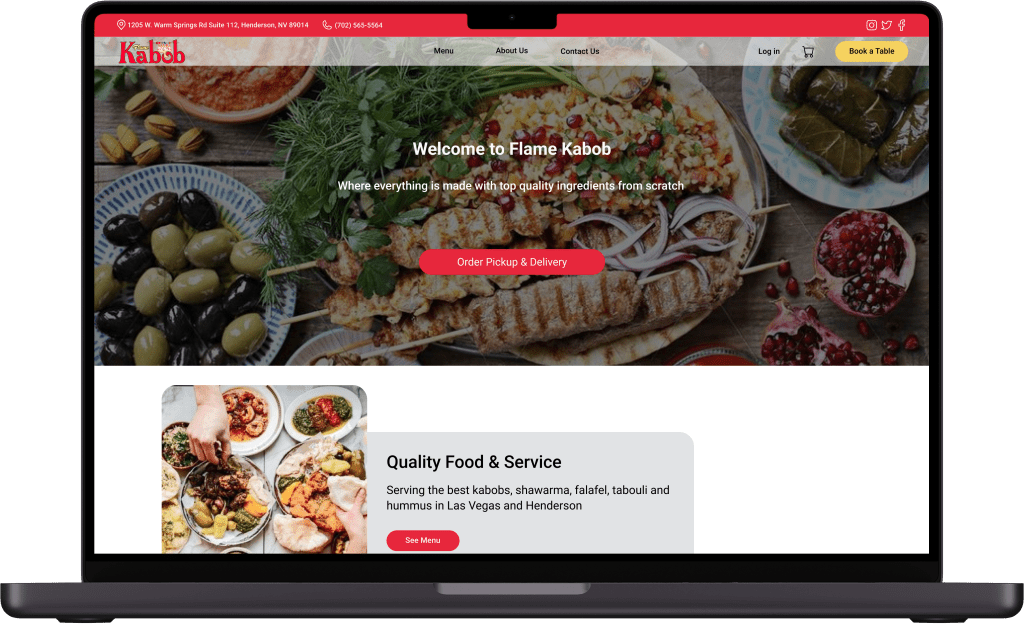
Flame Kabob is a family-owned Middle Eastern restaurant in Las Vegas and Henderson. Renowned for its authentic dishes made from scratch using top-quality, Halal meats, the restaurant has garnered a loyal customer base over its 30 years of operation.

4 Weeks

Group of 4

UX/UI Designer

Figma, Google Form, Photoshop, Open AI & Optimal workshop
The website wasn’t generating any online orders. Customers were either dining in or using third-party apps instead. The outdated design and poor user experience were major obstacles. To address this, the business pursued a comprehensive website redesign to enhance user experience and streamline the ordering process, with the primary objective of increasing direct online orders.
Our team of 4 followed a Double-Diamond approach based on the design thinking methodology. It was not a linear path; we bounced between stages as the project progressed.
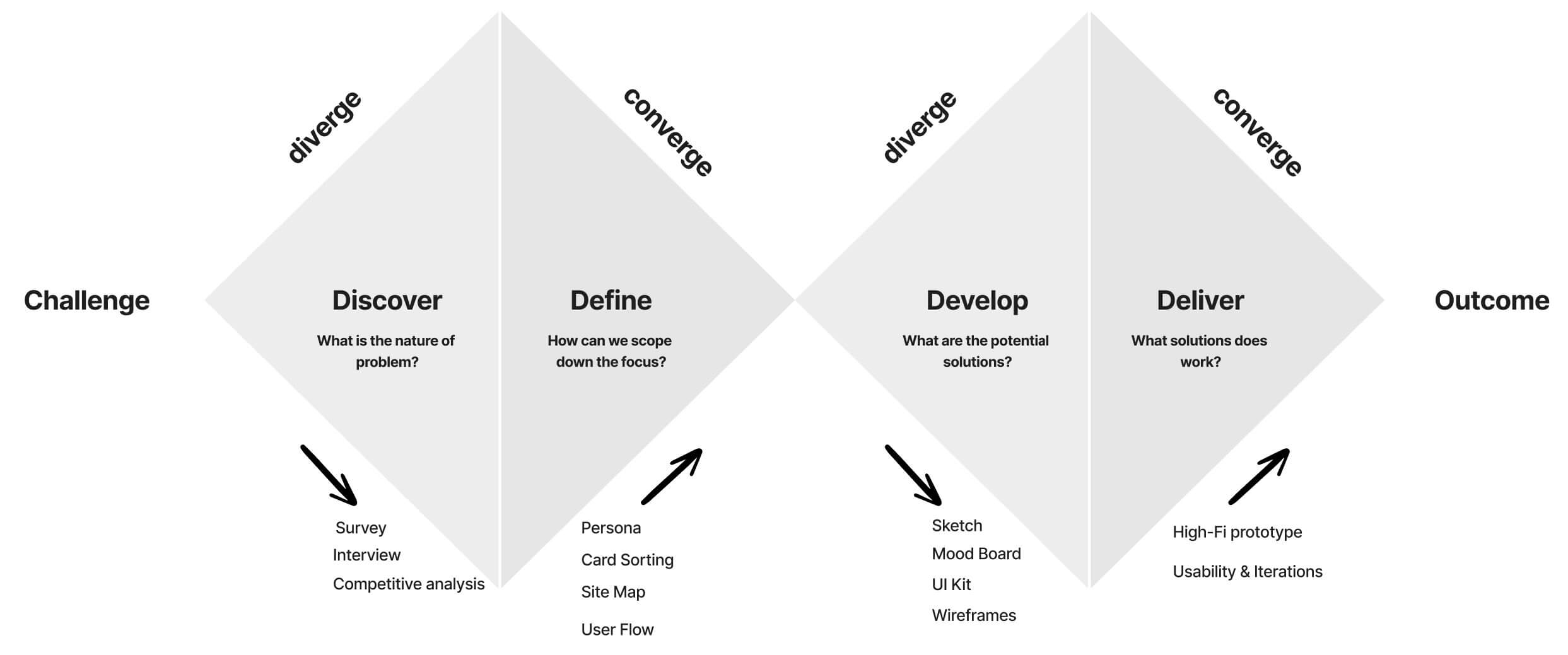
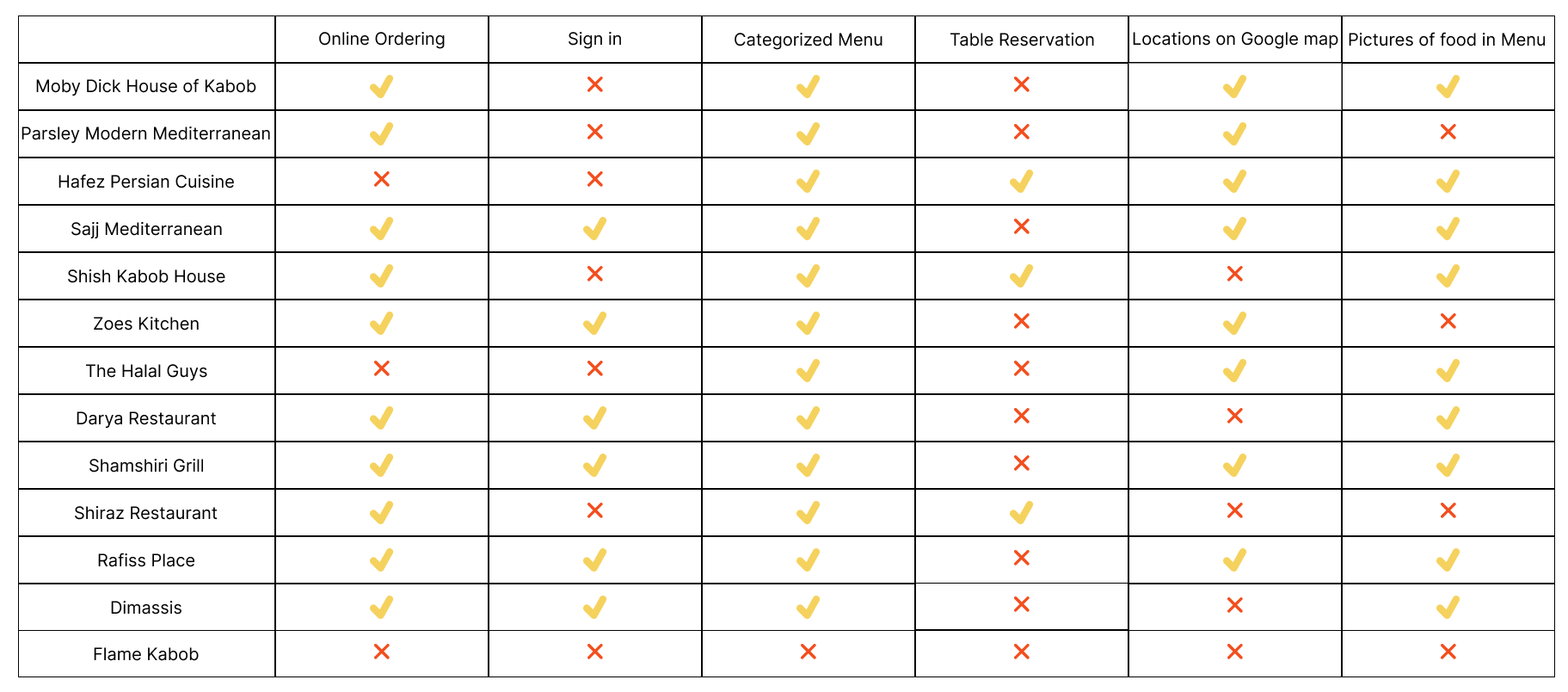
We began the project with comprehensive research to understand the target audience, analyze competitors, and pinpoint key pain points on the existing website. We used:
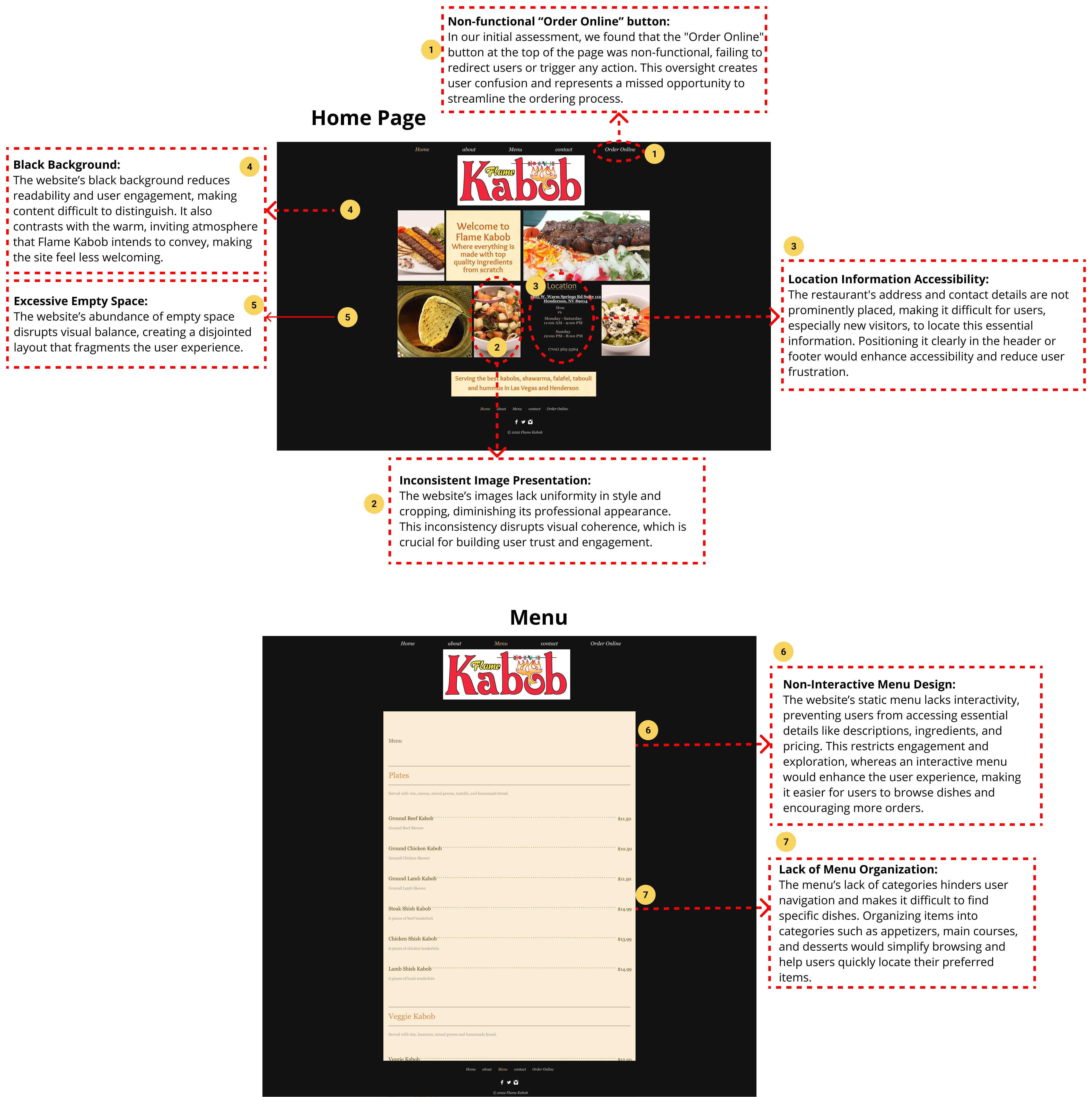
Heuristic evaluation involves a systematic analysis of a website’s usability, focusing on aspects such as navigation, information clarity, consistency, and error prevention. Based on the insights gained from this evaluation, we enhanced the browsing experience, making it more intuitive and user-friendly.







To better understand the needs and preferences of our target users, we conducted a survey. We received a total of 30 responses, of which 67% were between the ages of 35 and 44. Here are the key findings:
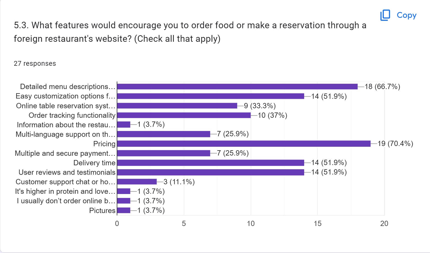
Features that would encourage people to order food or make a reservation through a foreign restaurant’s website include:
Key factors influencing online orders and delivery satisfaction:
To gain deeper insights into the needs and preferences of our target users, we conducted interviews with 12 individuals. These interviews provided valuable qualitative data to complement our survey findings.
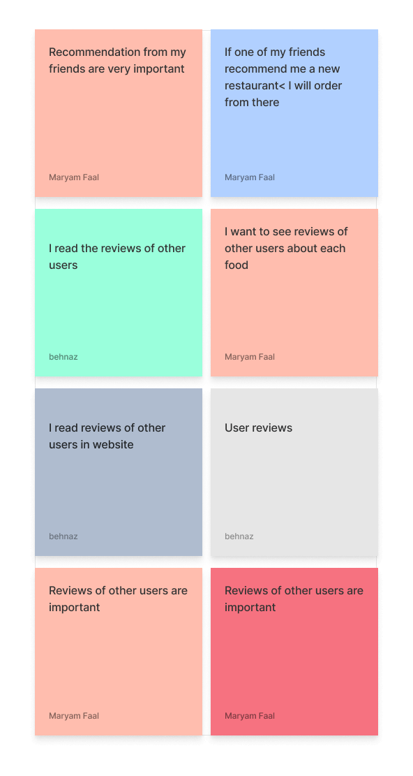
Review
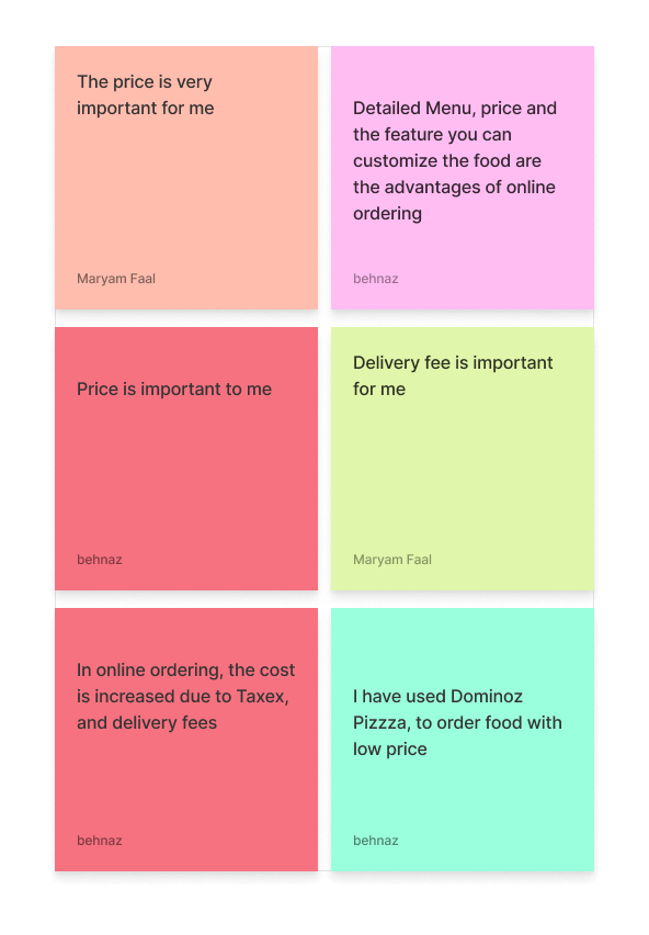
Price
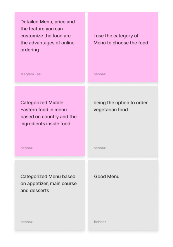
Categorized Menu
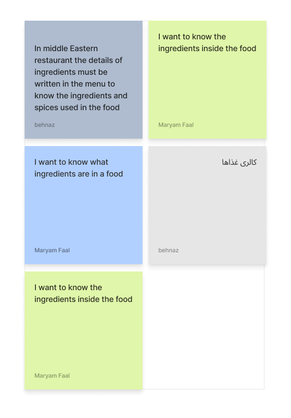
Information about Ingredients
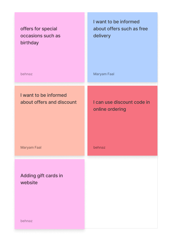
Information about Offers
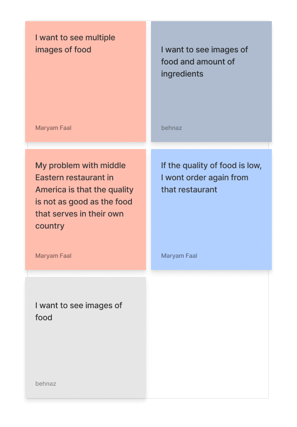
Images of Food
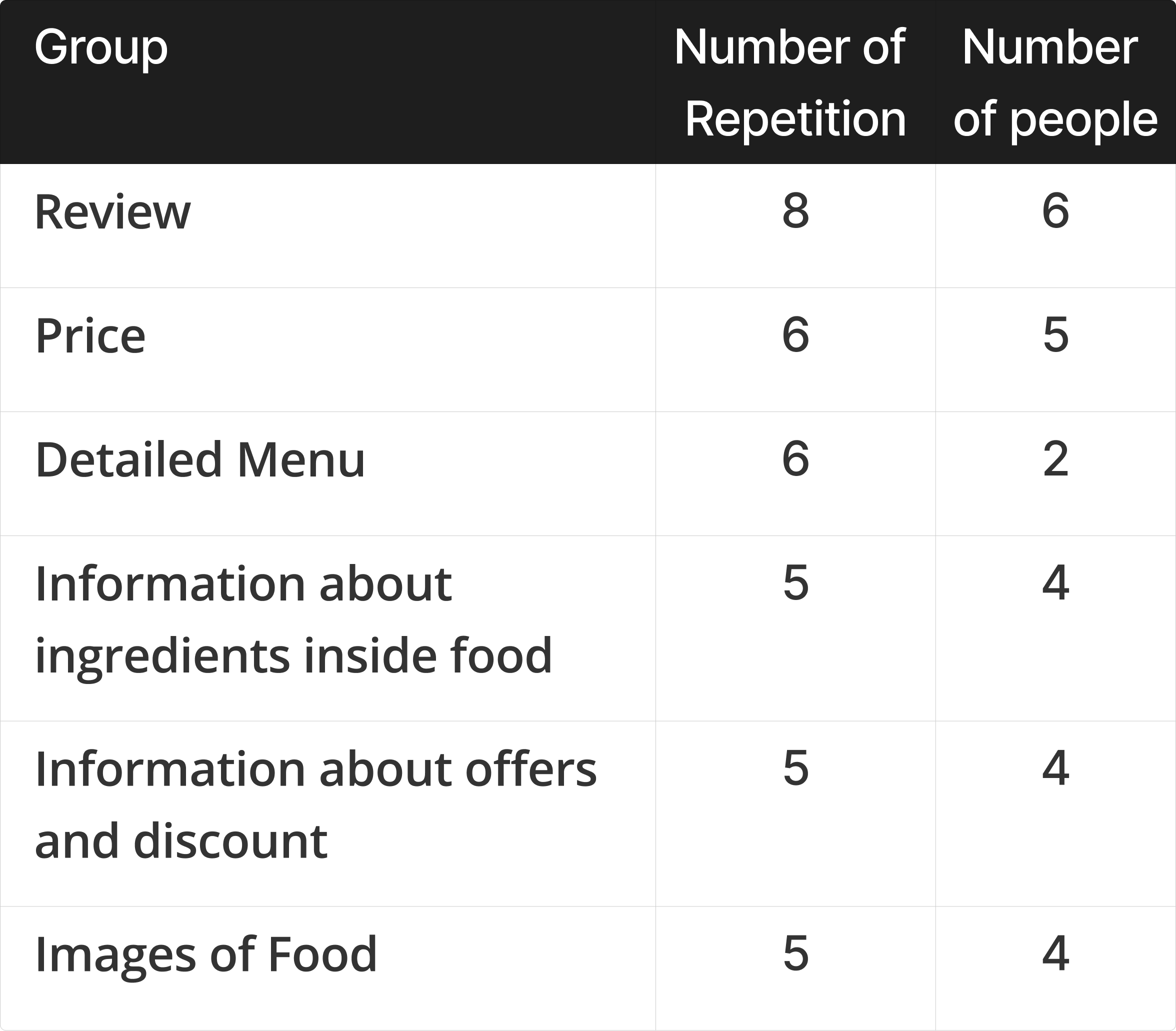
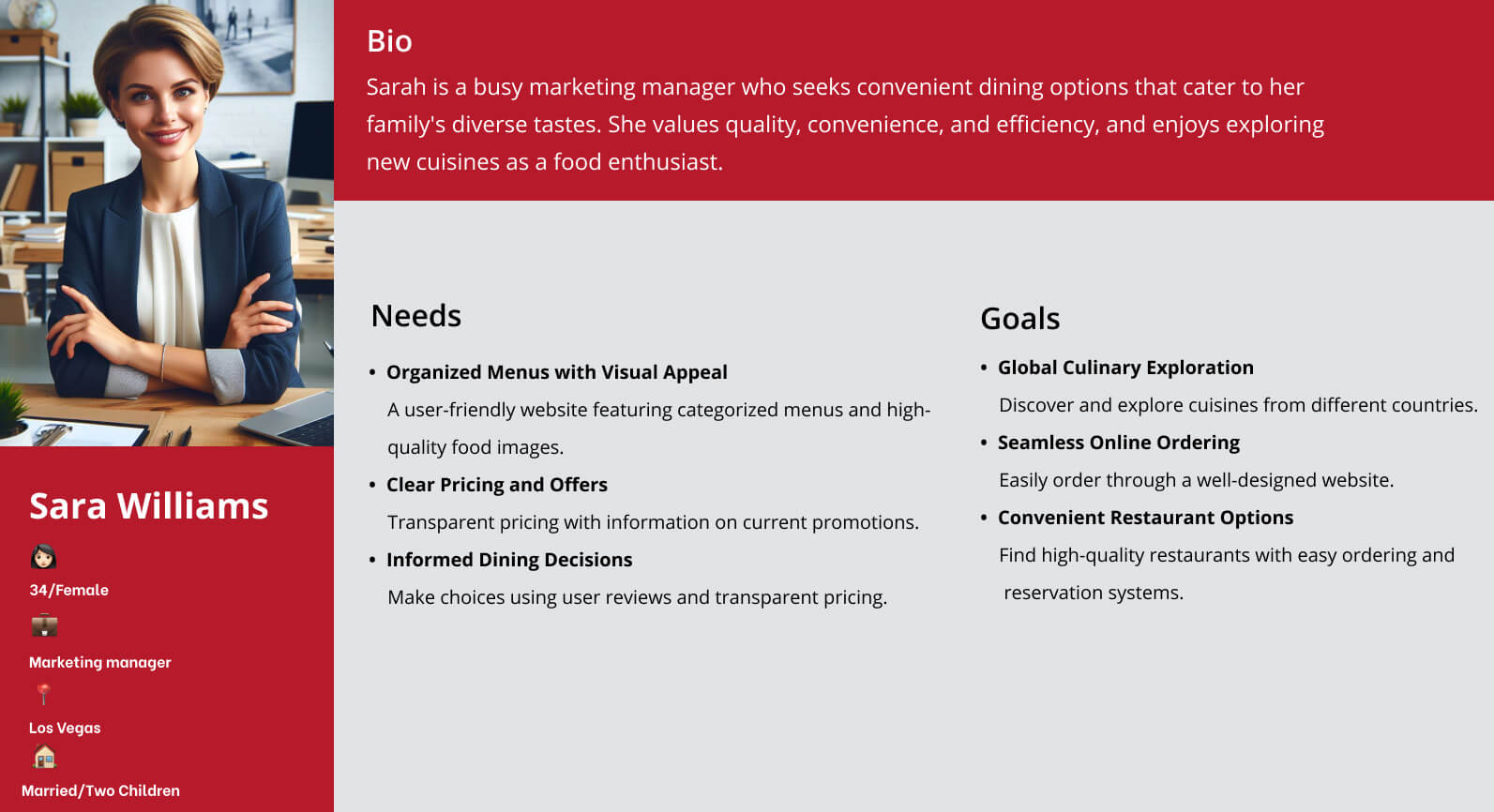
The research insights leading to the development of the persona revealed key patterns and pain points. These findings enabled us to gain a deeper empathy for the users and better understand their needs and challenges.
Through 10 close card sorting sessions, we gathered valuable insights on structuring various website sections. These findings helped us develop the initial version of our site map, tailored to the preferences and needs of our target users, which we continuously refined through user testing.


During the development phase, we encountered several challenges that required thoughtful solutions. Here are some key challenges and how we addressed them:
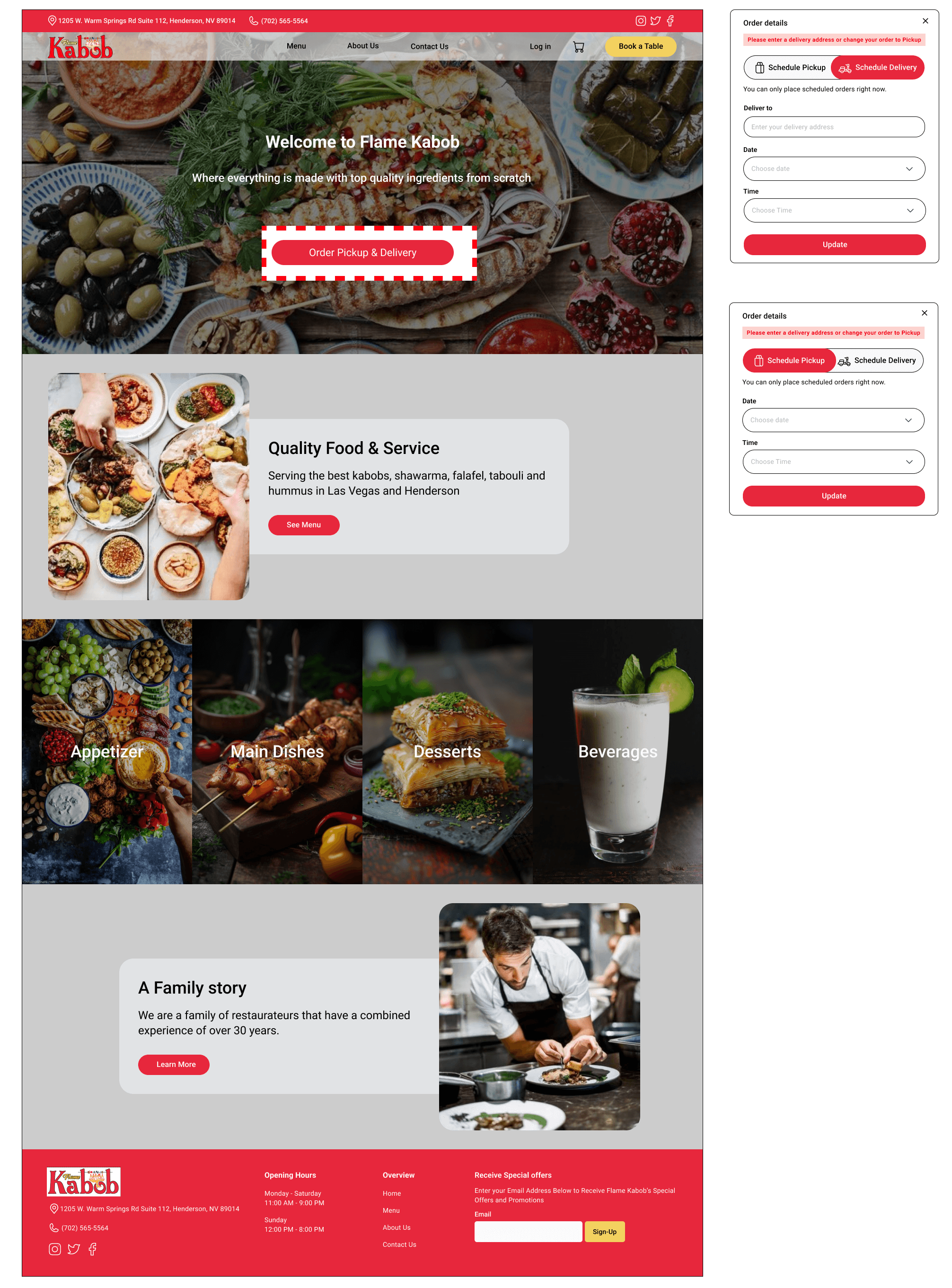
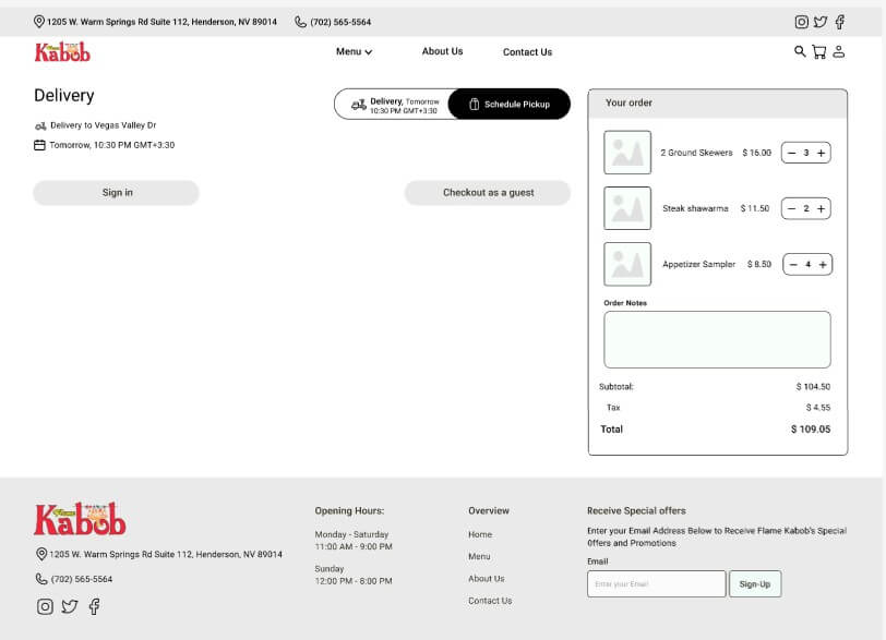
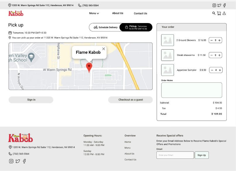
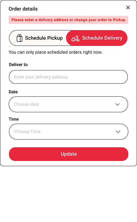
The primary challenge was providing users with an easy way to indicate their preference for in-person pickup or delivery to their address. This option needed to be readily accessible and adjustable throughout their browsing experience.
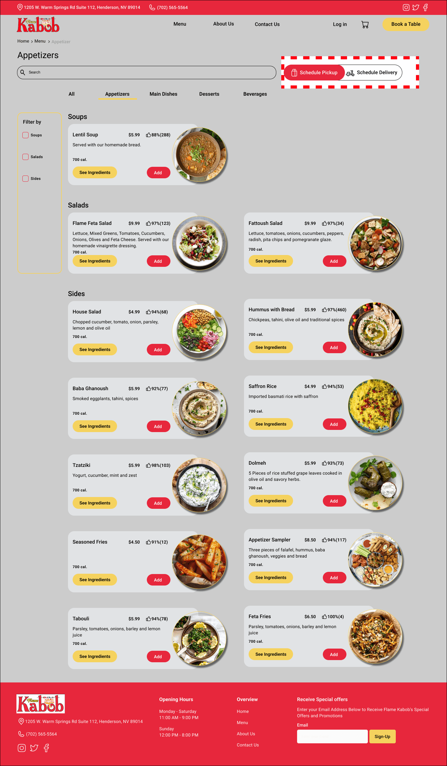
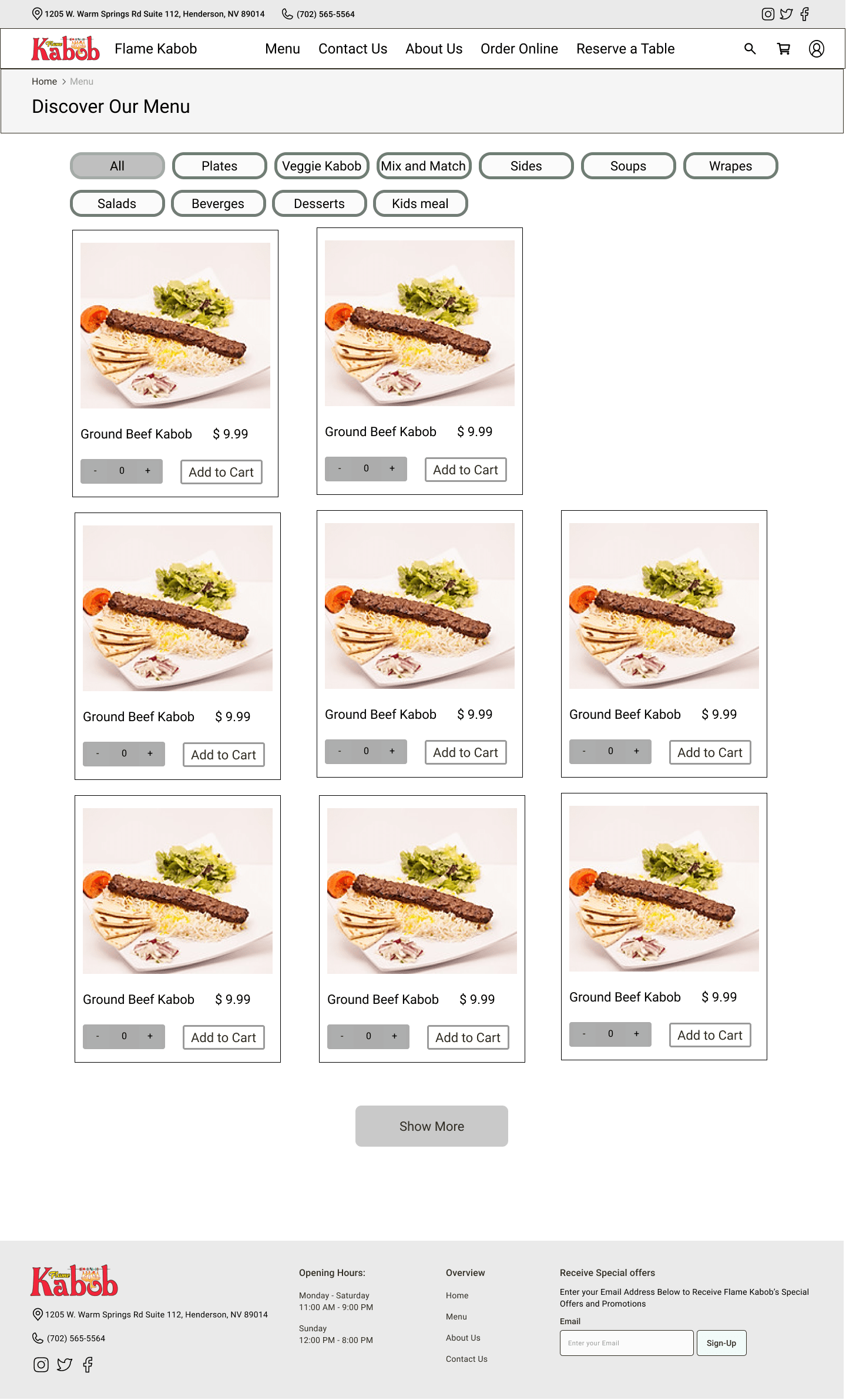
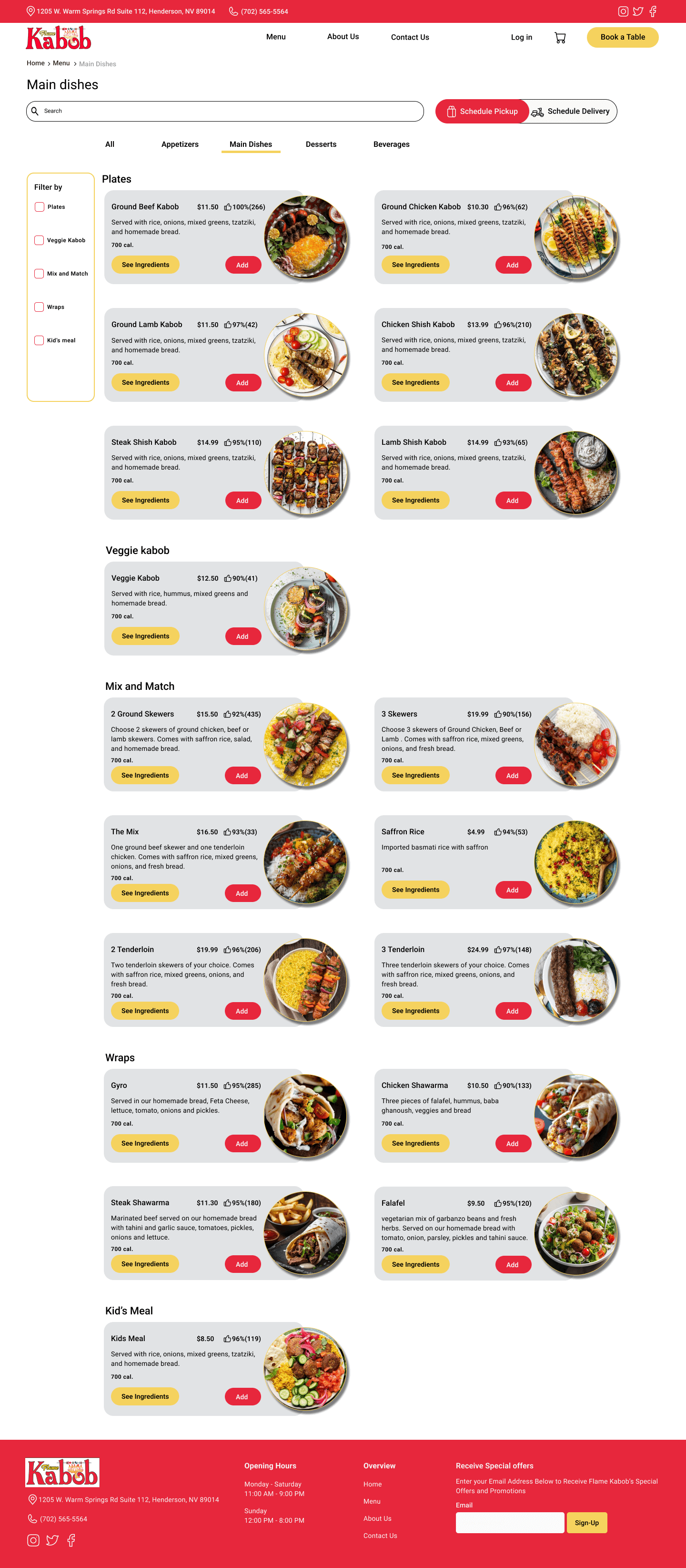
The original menu was not categorized, making it difficult for users to browse and find specific items quickly.
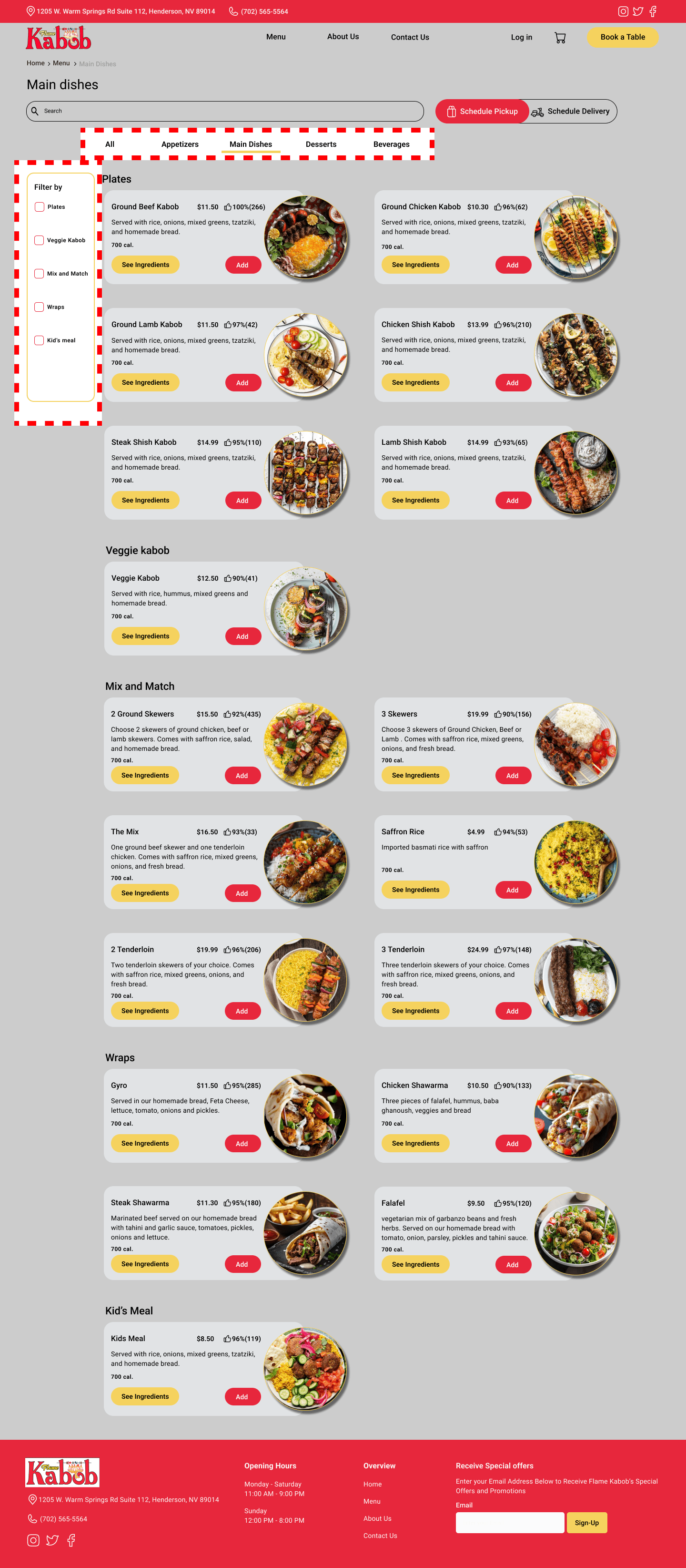
We implemented a well-structured, categorized menu, enhancing the user experience by allowing users to filter items by category, thereby facilitating easier exploration and selection.
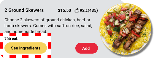
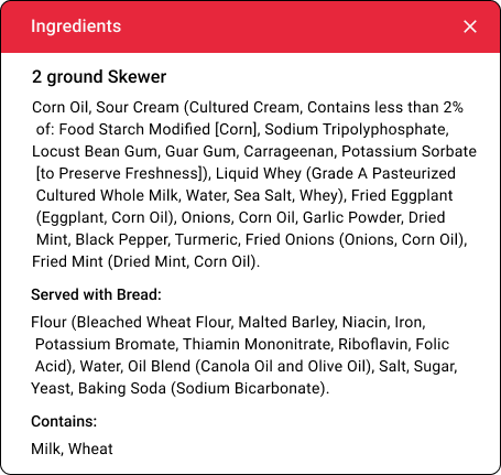
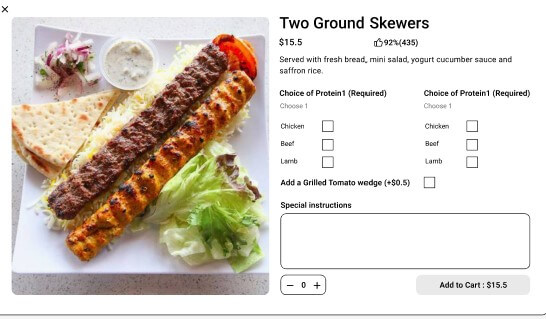
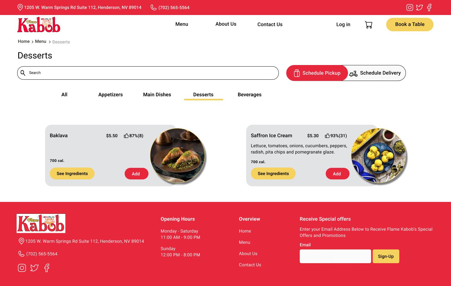
We incorporated detailed ingredient information and calorie counts into the food cards. This enhancement not only addressed users’ dietary concerns but also provided added value, enabling them to make informed decisions based on their preferences and restrictions.
Home Page
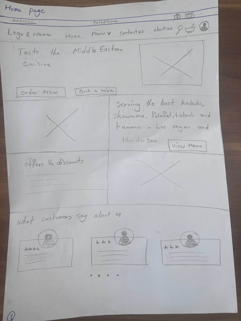
Menu Page
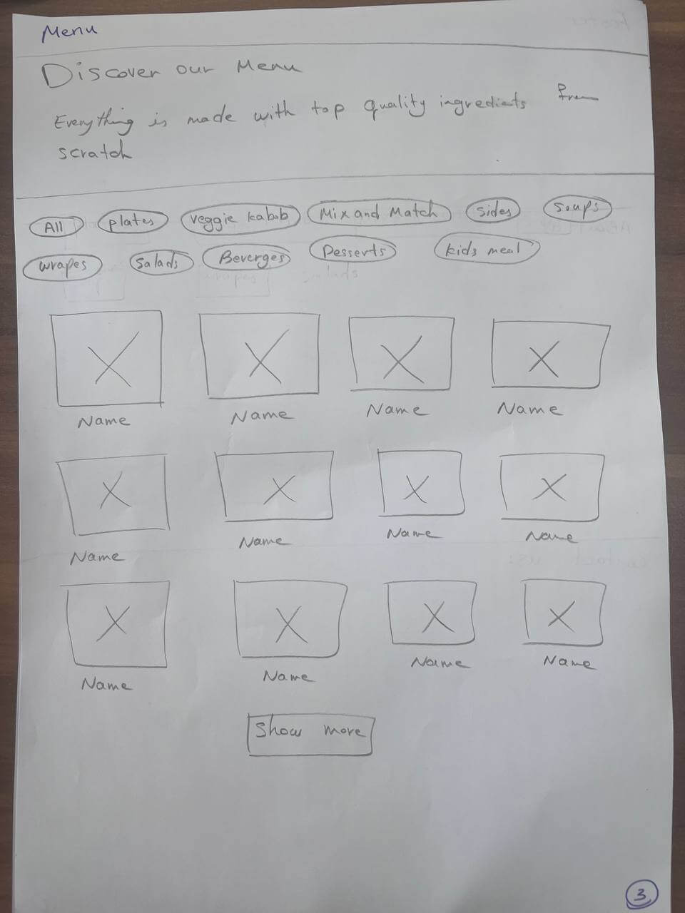
Checkout Page
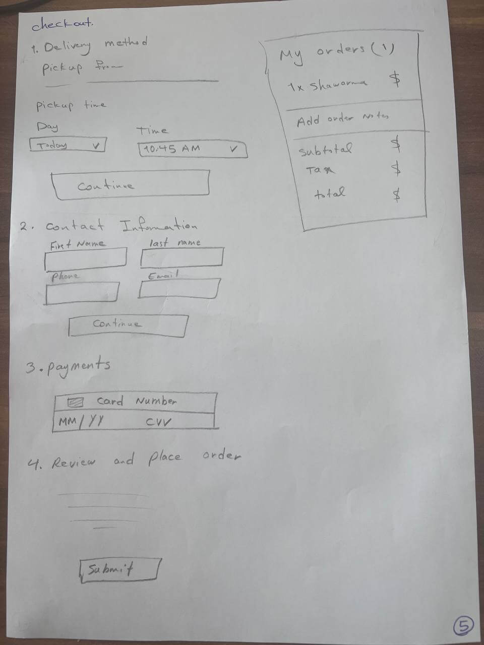
Home Page
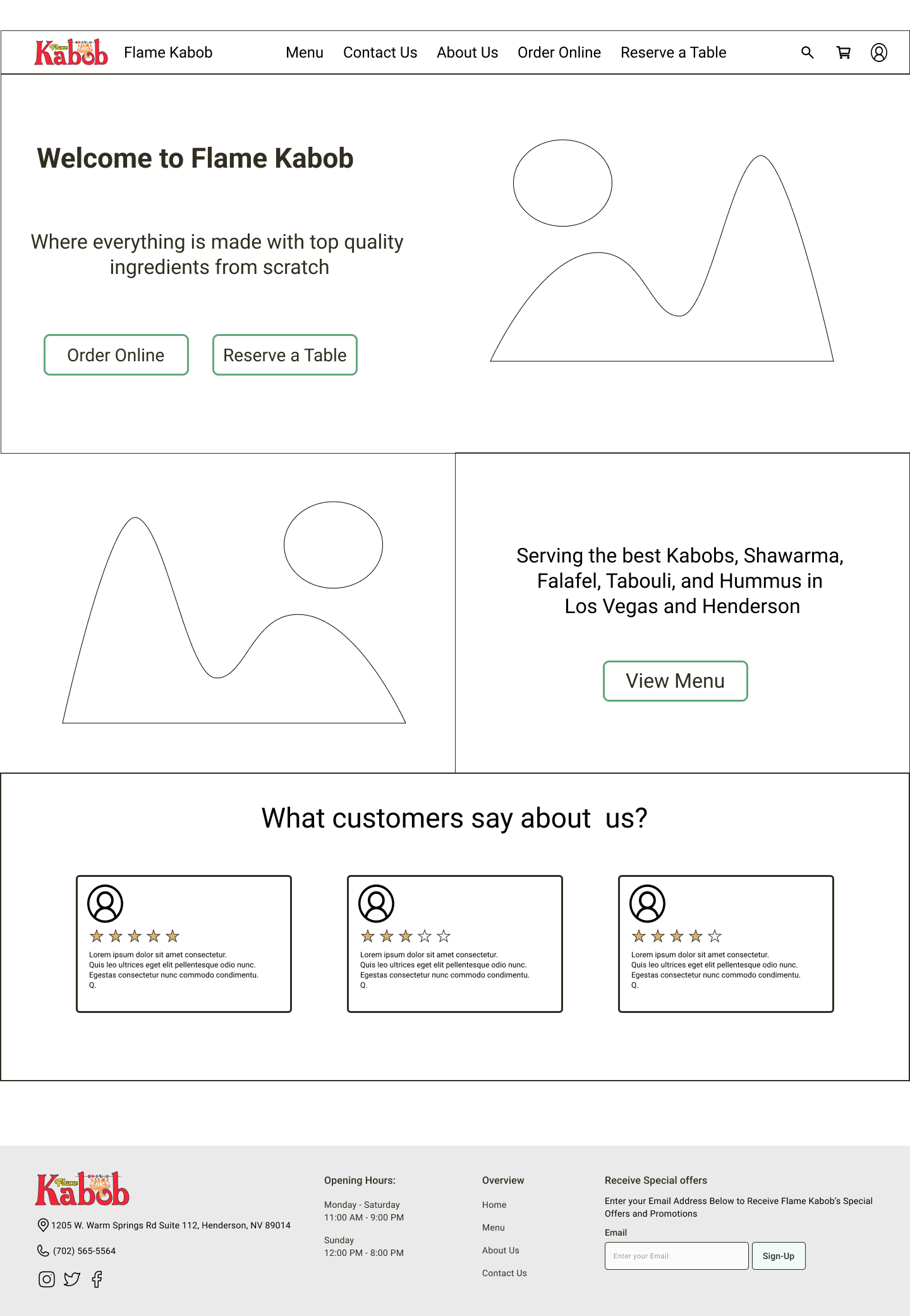
Menu Page
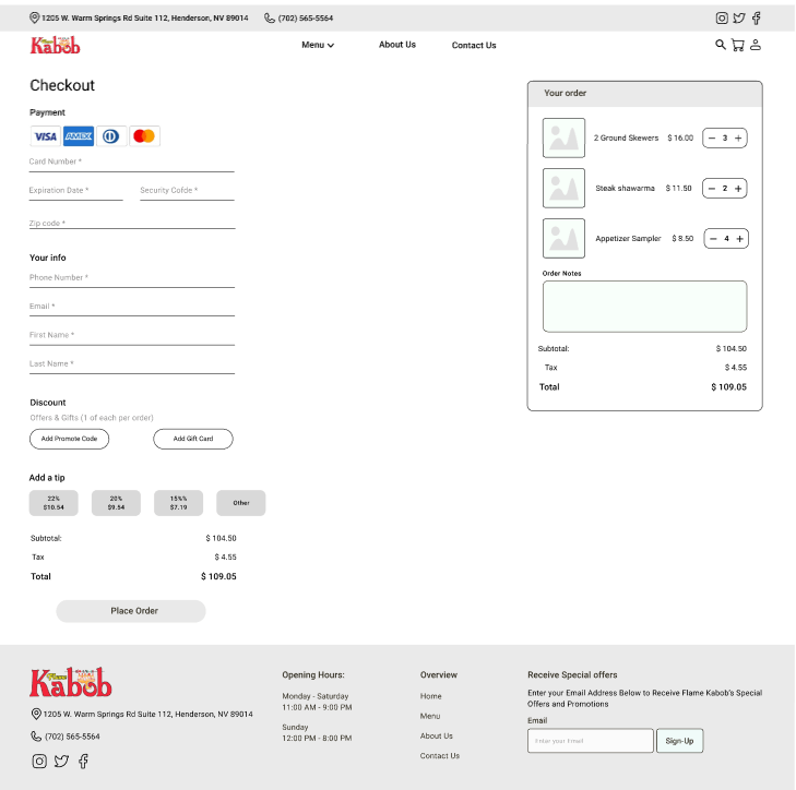
Checkout Page
Delivery Details Page
Pickup Details Page
Food Details Overlay
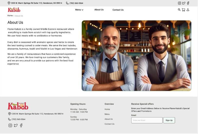
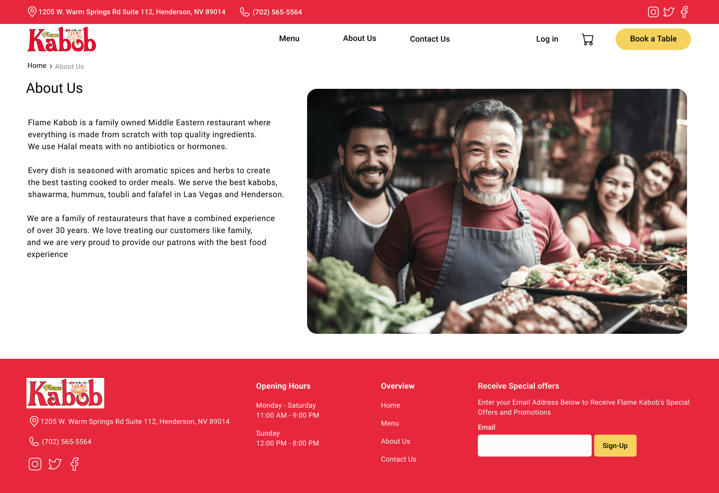
About Us Page
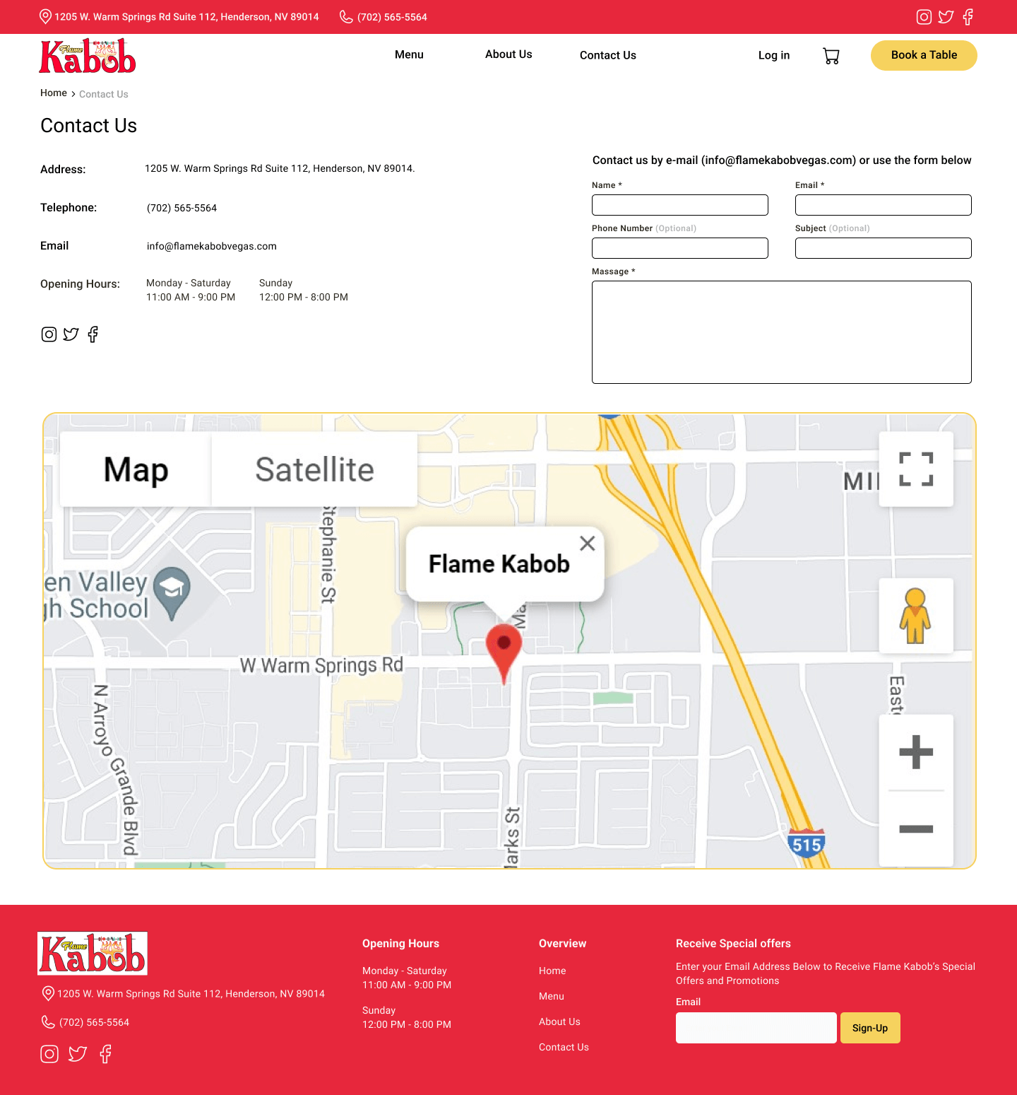
Contact Us Page

Home Page
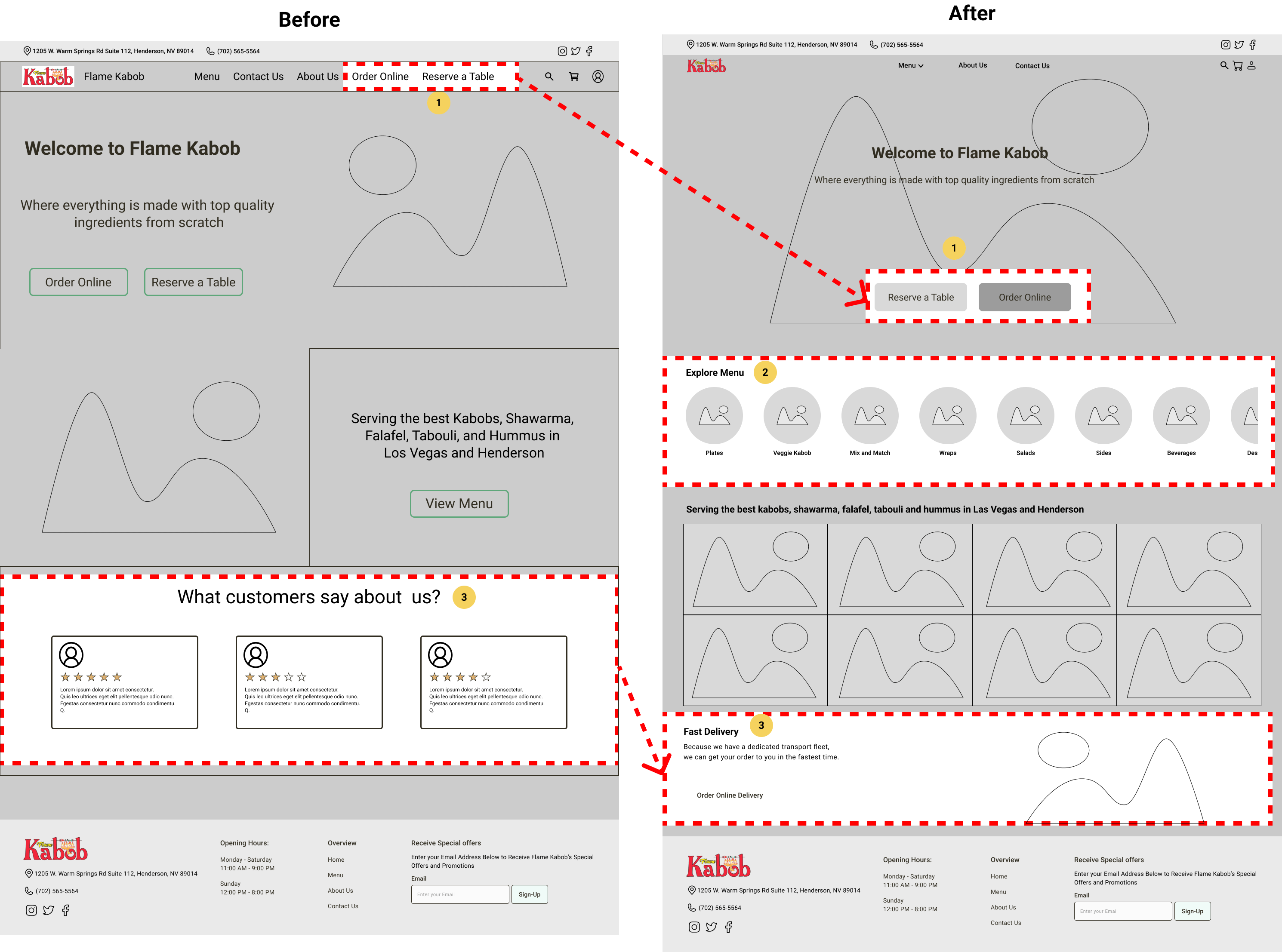
Home Page
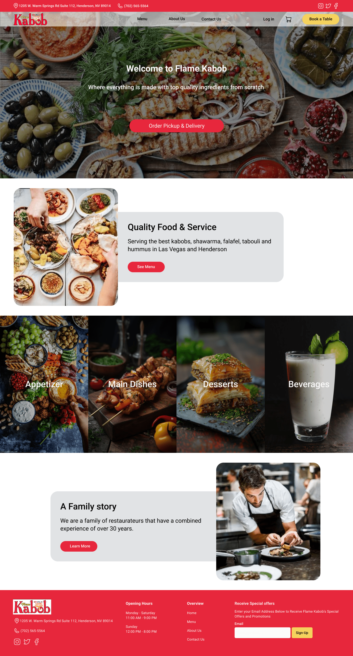
To streamline the cluttered navigation bar, we implemented the following changes:
Removed the “Online Order” and “Table Reservation” options from the navbar, positioning them prominently in the center of the homepage.
Reorganized the menu on the landing page into categorized sections to facilitate easier access.
Replaced the user reviews on the homepage with a new section highlighting the prompt delivery service available to customers.
Menu Page
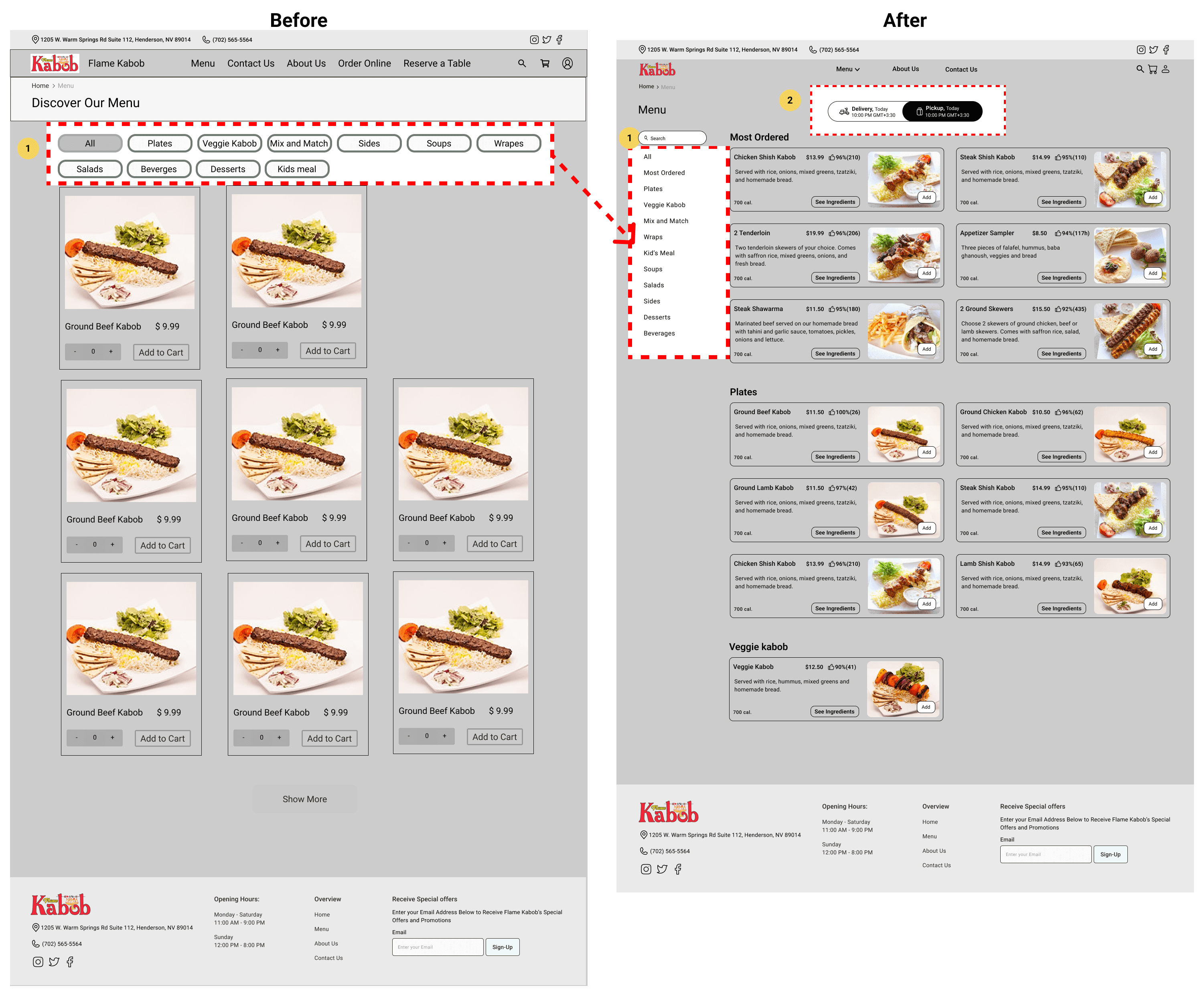
Menu Page
In the subsequent stage, we implemented the following changes:
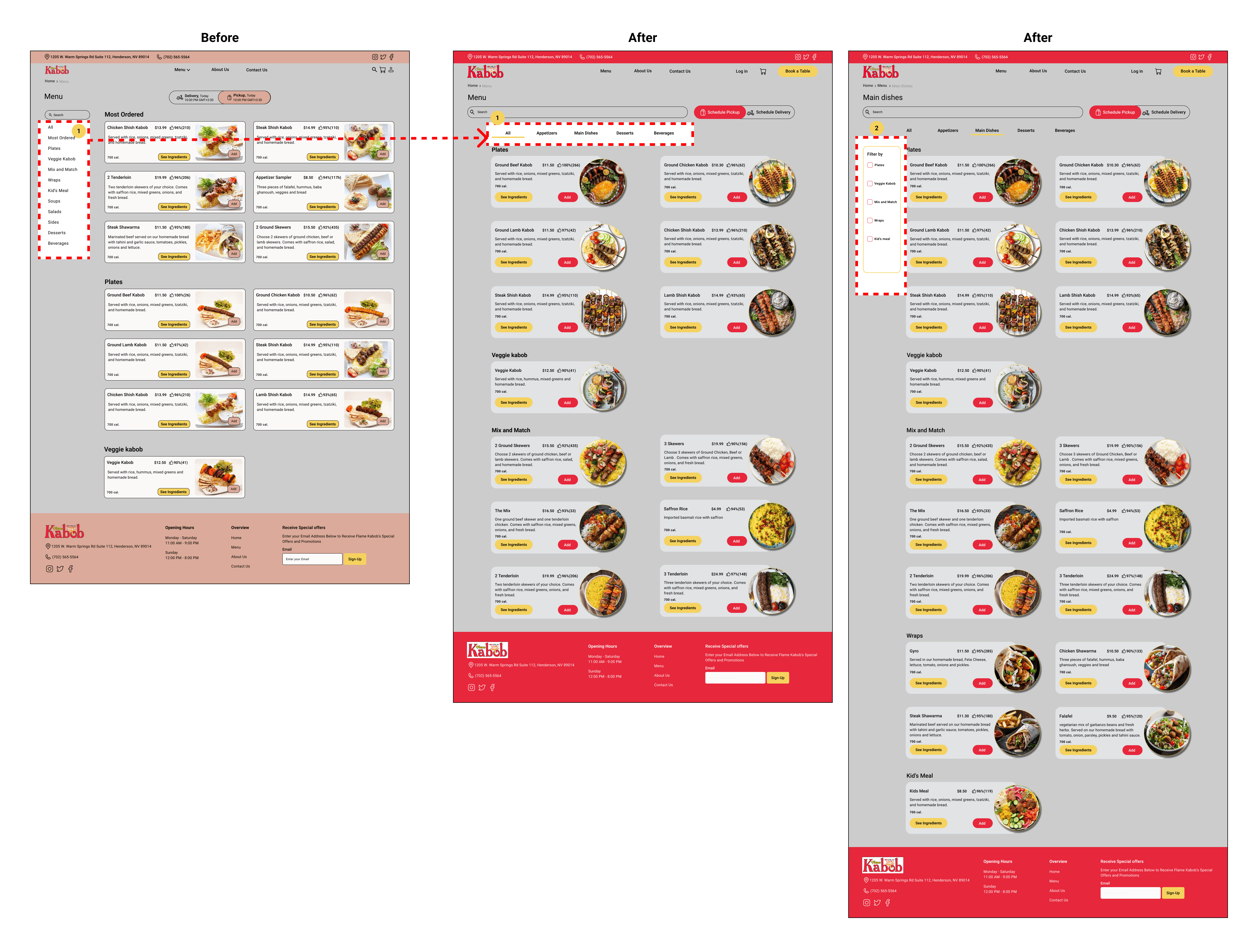
Removed the top buttons to categorize different types of food and replaced them with filters located on the left side of the page.
To enhance visibility for users struggling to locate the delivery or pick-up selection, we introduced a clear toggle positioned prominently at the center top of the page.
Food Card Overlay
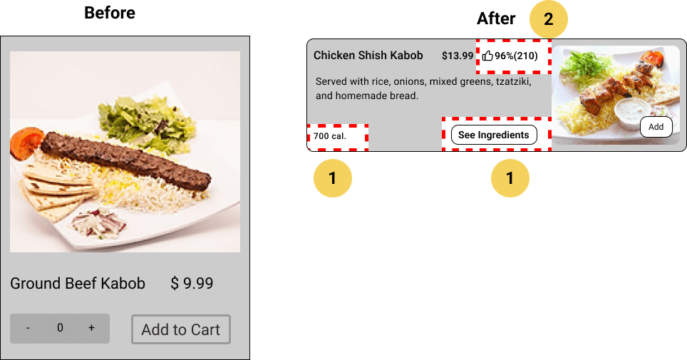
Food Card Overlay
We incorporated this information into the food cards.
We replaced the user reviews on the homepage with dish ratings and the number of people who rated each item, enhancing the value of the food cards.
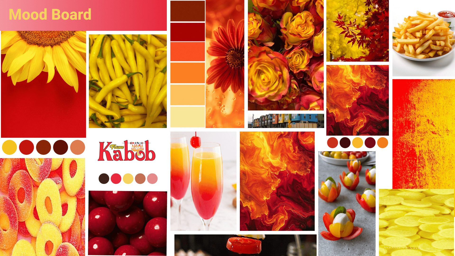
The next step in our process was color exploration. We incorporated the red and yellow colors from the logo, as the stakeholders requested that these colors be featured on the website. This approach helped establish the overall aesthetic of the site.
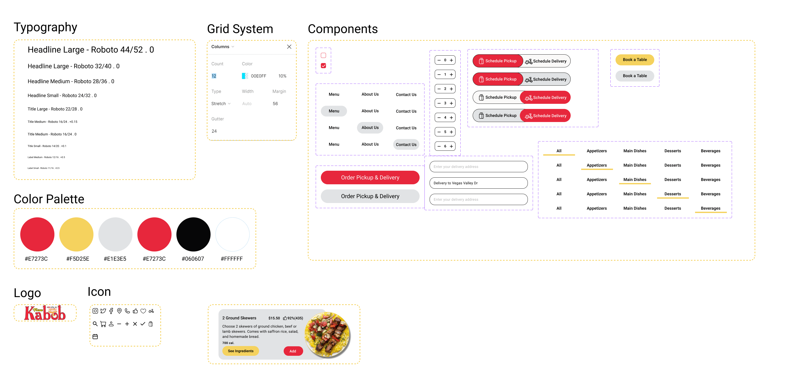
The UI Kit is an essential component of our design process, providing a collection of standardized design elements and components that ensure consistency and efficiency throughout the development of NeighbourTools. This toolkit helps maintain a cohesive look and feel, streamlining the design and development process.
Home page
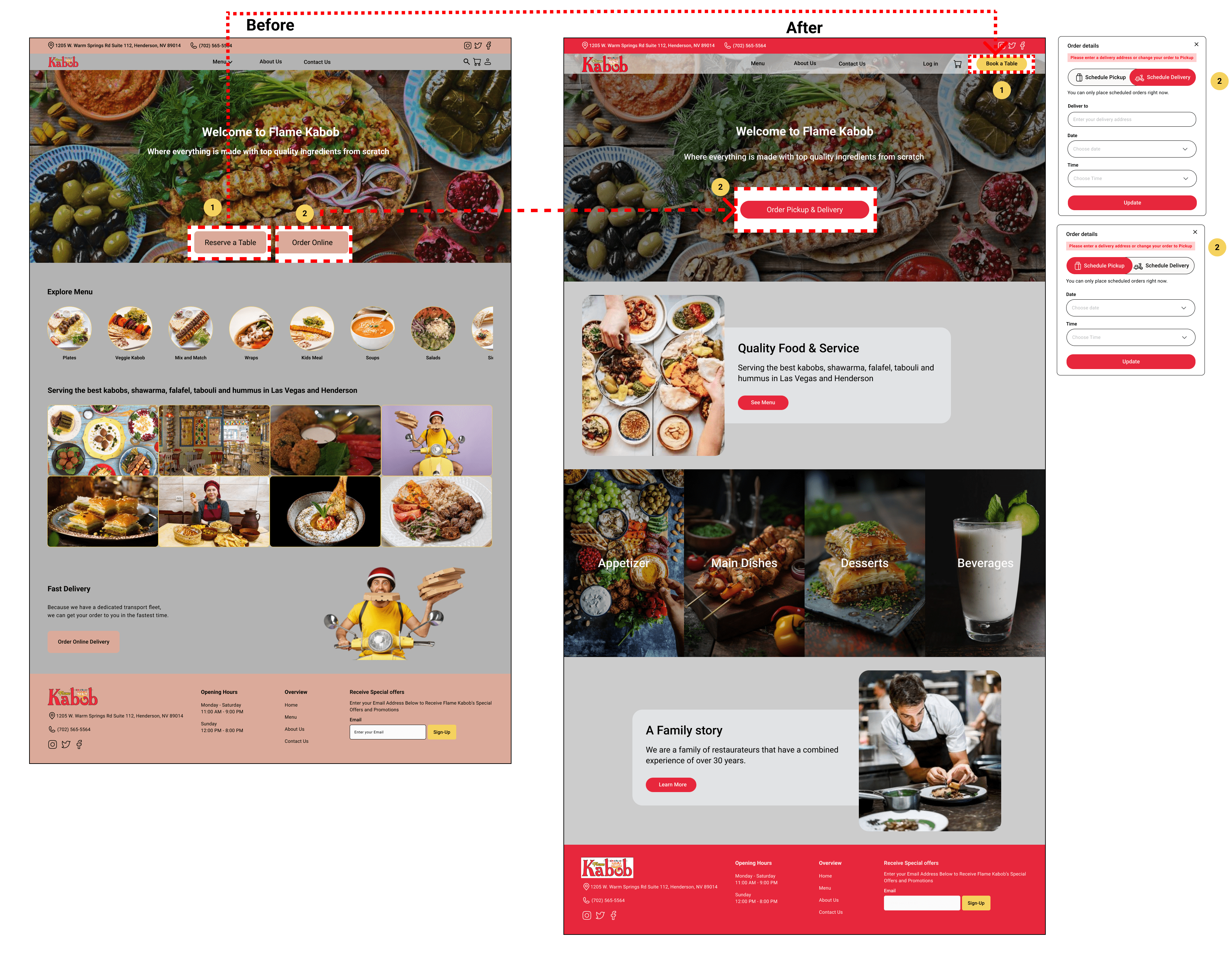
Home Page
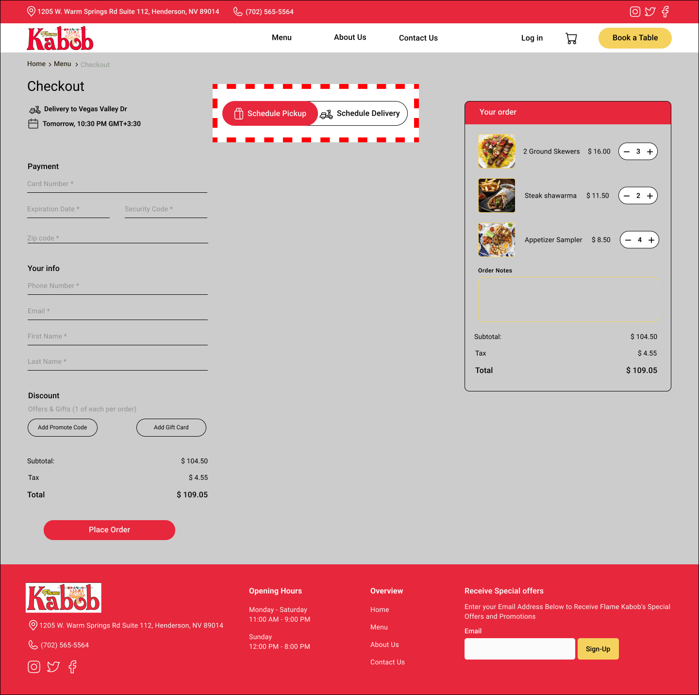
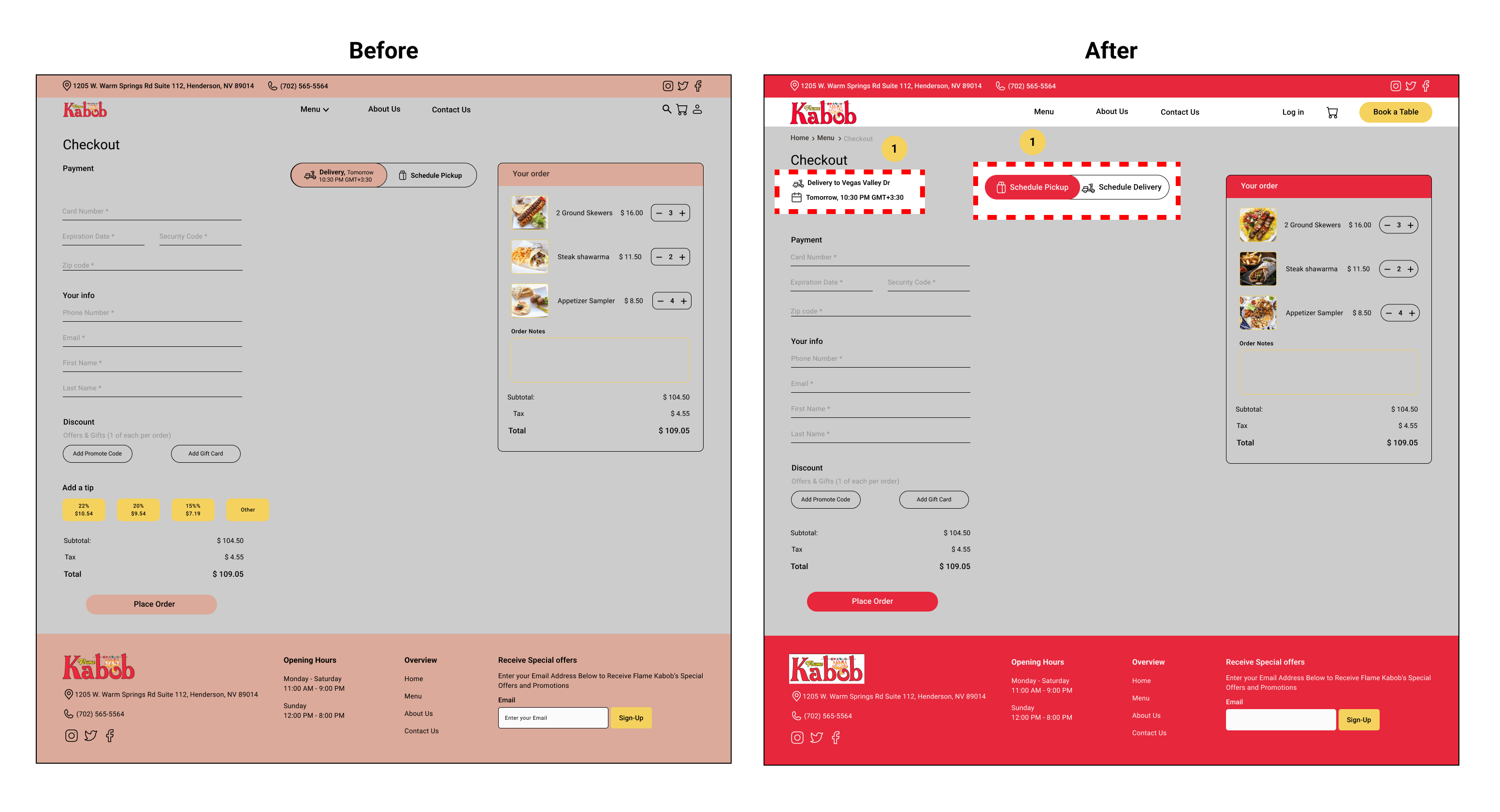
During testing, users frequently overlooked specifying whether they wanted to pick up their order or have it delivered. To resolve this issue:
Menu Page
Menu Page
Another observation from user testing was the challenge users faced in finding specific dishes within the menu. To enhance this experience:
Checkout Page
Checkout Page
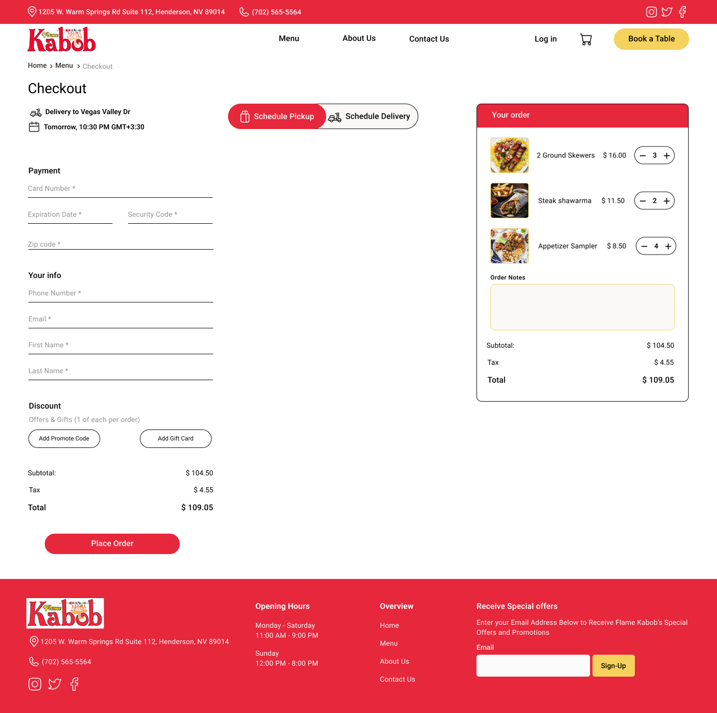
Finally, we placed the user’s selected address, date, and time at the top of the checkout page, allowing them to review these details and make changes easily with an adjacent edit button.
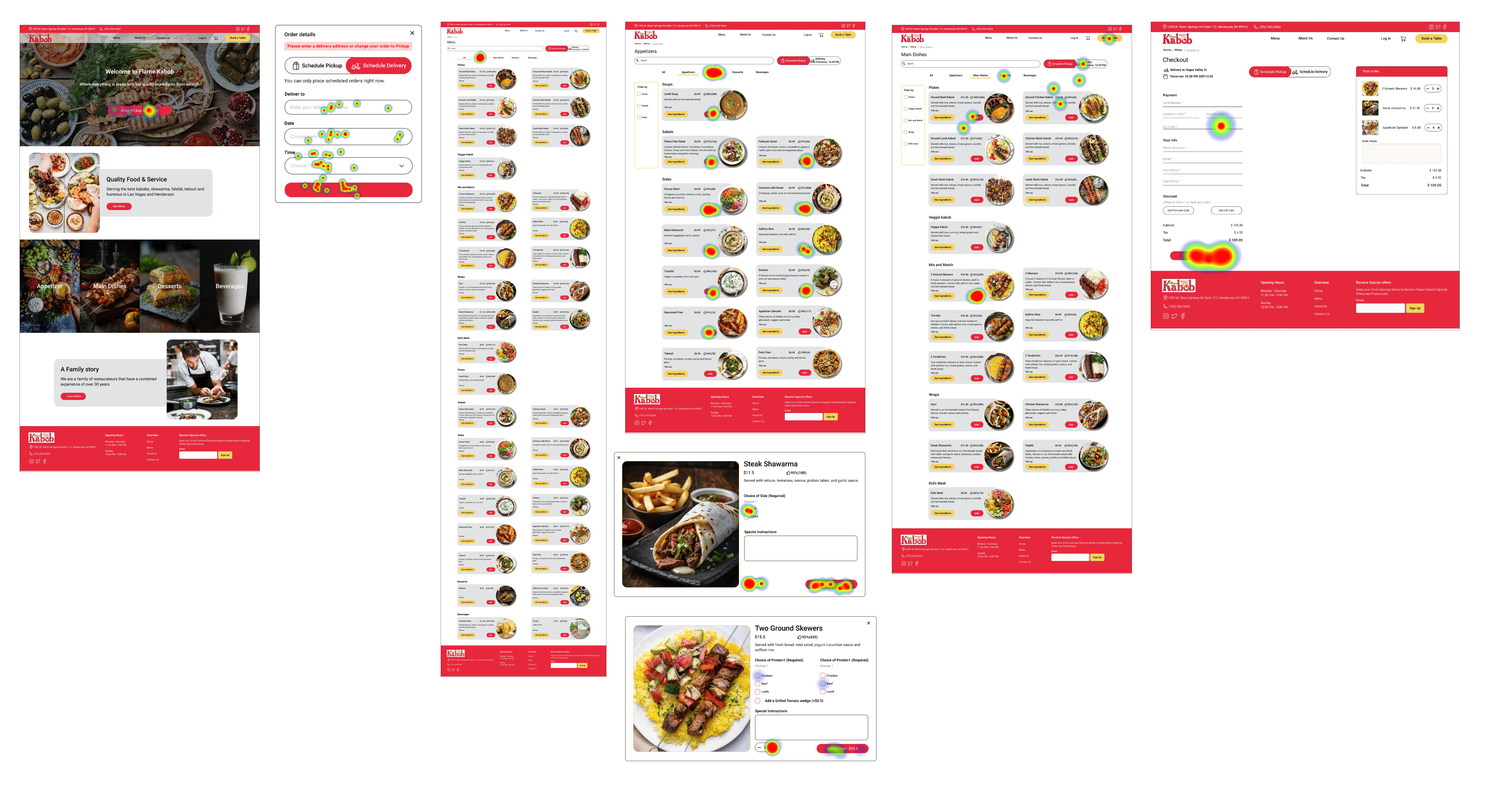
Heat map optimal path analysis
To analyze the success and confidence of users in one of the most important IAB tasks (donation), we have set up a test platform on Maze. The users have been asked to support IAB by donating $300 to the general fund.
All users completed the task without giving up or bouncing.
As compared to the existing website, the duration of the task has decreased by 50%.

0%

732s

100%
Home Page
Main Dishes Page
Ingredients Overlay

Delivery Overlay
Menu Page

Contact Us Page
About us Page
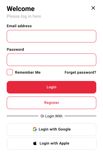
Log in
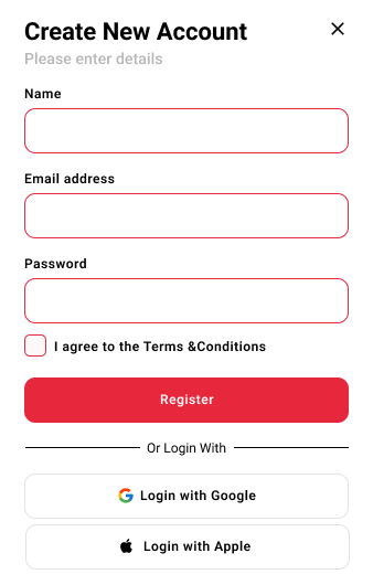
Create New Account
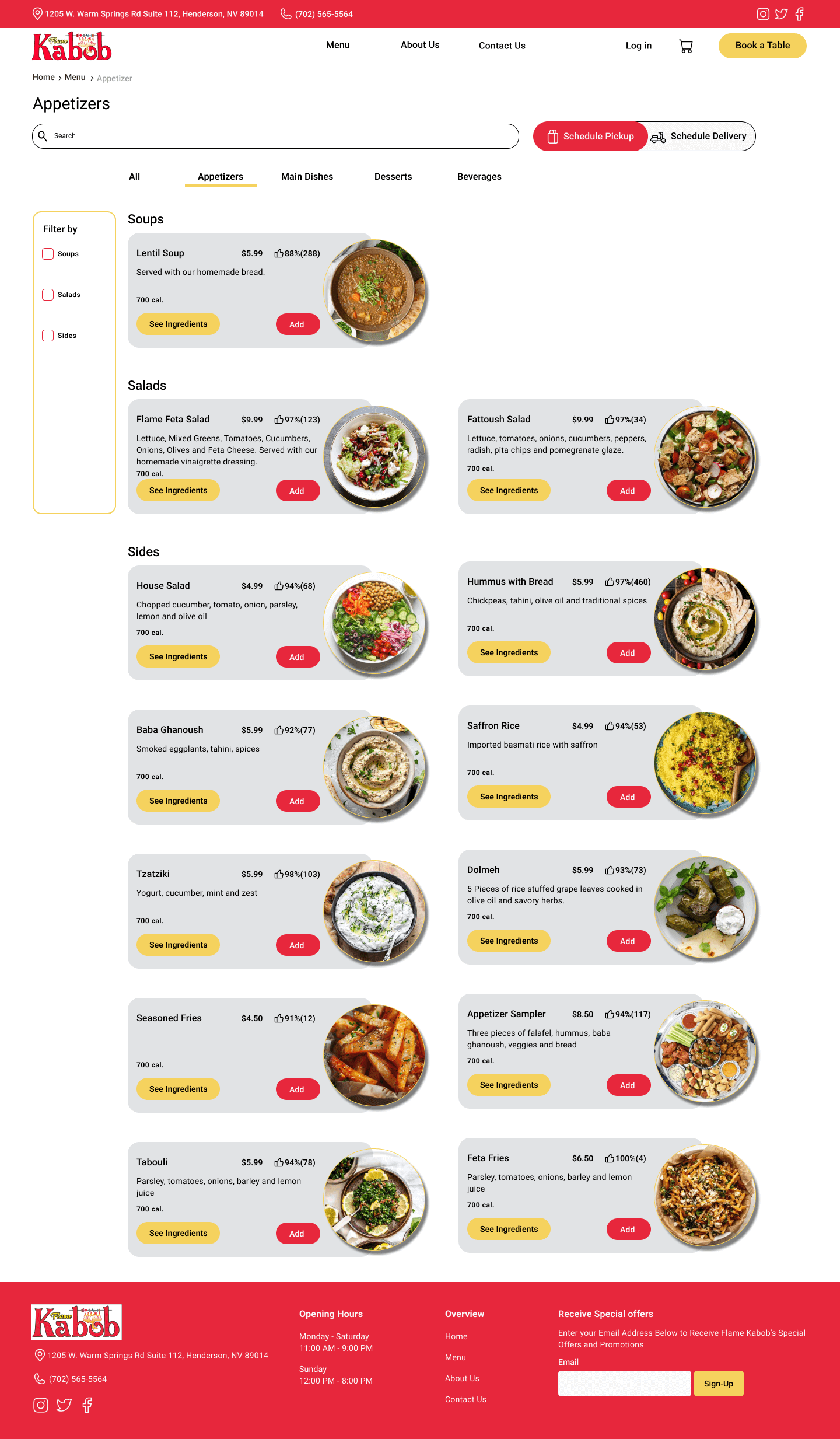
Apptizer Page
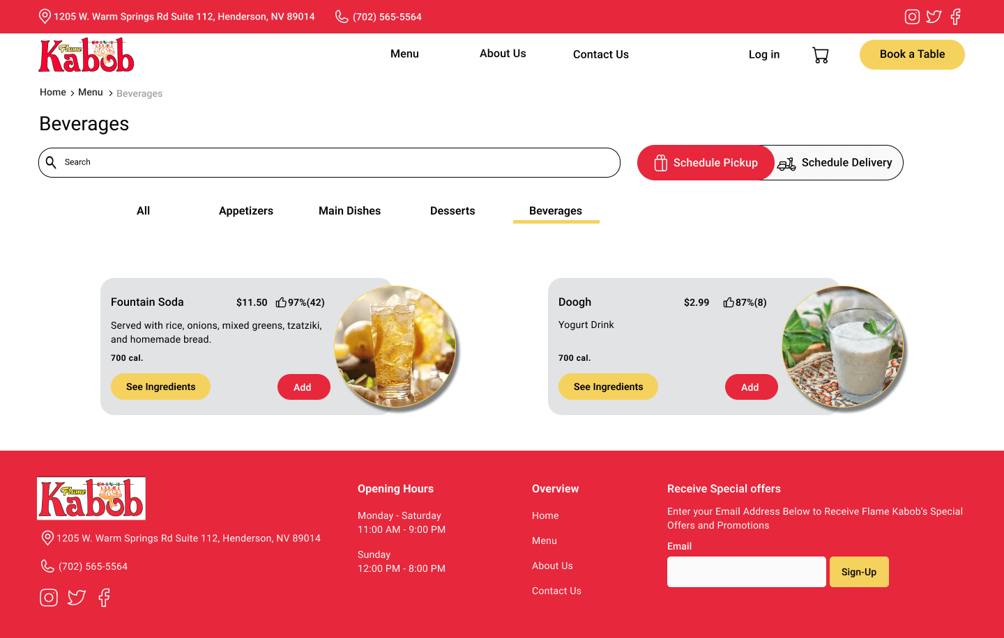
Beverages Page
Desserts Page
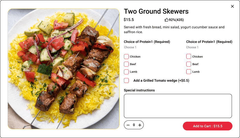
Main Dishes Details Overlay
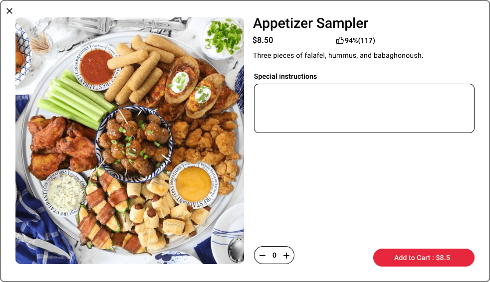
Appetizer details overlay
Checkout Page
Confirmation Page
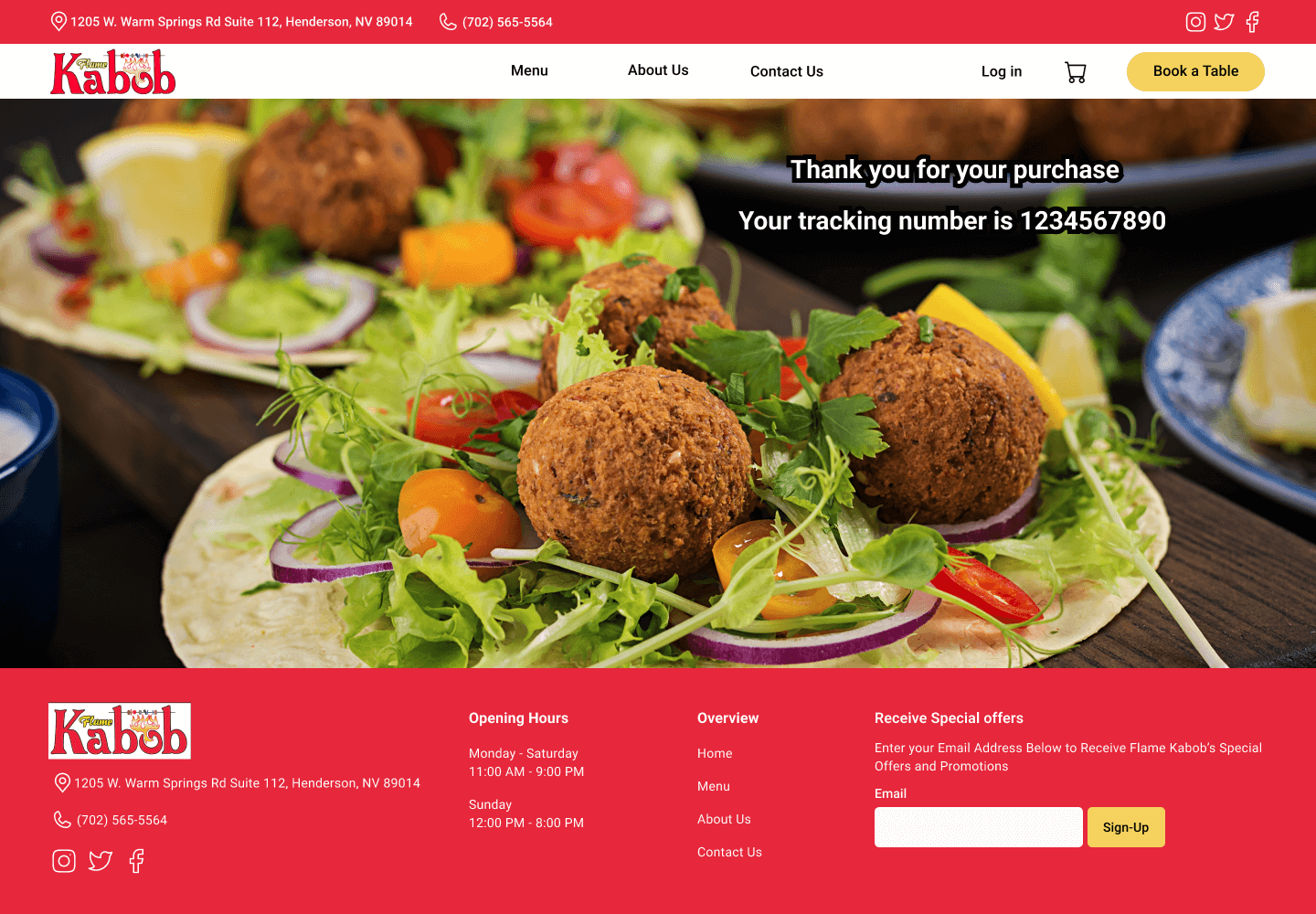
Here is the last prototype, displaying what we have achieved through our design process.